Color psychology in marketing is the study of how specific colours trigger emotional and physiological responses that shape trust, urgency, and buying decisions within seconds, before a prospect reads a single word on a website or truck wrap. Blue signals stability, red drives urgency, and neutrals like grey and charcoal build authority. For trades and industrial brands, getting this right directly affects lead quality and conversion rates.
Choosing a brand colour because the owner likes blue, or because a competitor uses red, is a common habit among growth-focused trades and industrial companies. That gut-feel approach skips the psychology that actually shapes how a prospect judges professionalism, trust, and urgency within seconds of seeing a truck wrap or a homepage.
This guide breaks down what each major colour communicates, how brands like Coca-Cola, IBM, John Deere, and Tesla have built recognition around deliberate colour choices, and how construction, trades, and industrial brands can use colour with intention rather than guesswork. Cutting Edge Digital Marketing works with Alberta-based service and industrial businesses on exactly this kind of strategic branding decision every day. Contact us to see how colour choice becomes a measurable growth lever instead of a design afterthought.
Key Takeaways
Colour psychology in marketing influences up to 90% of snap purchase judgments and can lift brand recognition by up to 80%, making colour one of the highest-leverage decisions in any branding project.
Trust-building colours such as blue, green, and grey suit industrial and trades branding, while urgency colours such as red and orange work best for calls-to-action and time-sensitive offers.
Colour psychology only pays off when it’s applied consistently across the website, ad creative, vehicle wraps, and printed materials rather than treated as a one-off design choice.
A/B testing tools such as Optimizely and VWO remove guesswork from colour decisions by tying button colours, landing pages, and ad variations directly to quote requests and cost-per-lead.
Cultural and regional context matters for Canadian audiences, since colour meanings shift across Western, Asian, and Indigenous communities, such as white symbolizing purity in many Western contexts but mourning in several East Asian traditions.
Table of Contents
- What Is Color Psychology And Why Does It Matter In Marketing?
- The Psychology Of Color In Marketing And What Each Color Communicates
- How Color Influences Branding And Marketing Across Channels
- Which Colours Work Best For Trades, Construction, And Industrial Brands?
- How Can You Test And Measure Colour Psychology’s Impact On Conversions?
- How Cutting Edge Digital Marketing Applies Colour Strategy For Growth-Focused Businesses
- The Takeaway
- Frequently Asked Questions
What Is Color Psychology And Why Does It Matter In Marketing?
Color psychology in marketing is the study of how individual colours trigger emotional, physiological, and cognitive responses that shape how consumers perceive a brand and decide whether to act on it. It matters because colour is rarely a neutral design choice; research consistently shows that colour alone accounts for up to 90% of a person’s snap judgment about a product or business, while consistent colour use can increase brand recognition by up to 80% across touchpoints, a finding echoed in broader logo statistics and brand recognition data. The Pantone Color Institute has spent decades studying these reactions, and its annual Colour of the Year selections often influence how mainstream brands approach palette decisions. For an established service or industrial company competing against several similar-looking competitors in the same region, that gap in recognition and instant credibility can directly translate into which business gets the call for a quote.
How The Brain Processes Colour Before Anything Else
The brain registers colour before it processes text, logos, or layout, which is why a website visitor forms an impression within milliseconds of a page loading, echoing research on first impressions driving brand value in the first few seconds of contact. That reaction splits into two layers:
A conscious layer where people can name a colour and state a preference.
An unconscious layer where the same colour quietly shapes mood and trust without the viewer noticing.
For a construction fleet or a homepage, this speed means the colour palette often does more first-impression work than the copy sitting on top of it.
The Psychology Of Color In Marketing And What Each Color Communicates
The psychology of color in marketing works by pairing each hue with a fairly predictable emotional association, then applying that colour where the emotion supports the business goal. Red raises heart rate and signals urgency, which is why Coca-Cola built a global brand around it and why red dominates calls-to-action and emergency-service messaging, while blue does the opposite by lowering perceived risk and building the sense of stability that industrial and financial brands depend on, a strategy IBM has leaned on for decades. Green carries associations with growth, health, and environmental responsibility, making it a natural fit for companies genuinely positioning around sustainable practices (John Deere’s green-and-yellow equipment palette is a well-known example), while yellow and orange trade on optimism and approachability but fatigue viewers quickly if overused as a dominant colour rather than an accent. Purple signals luxury and sophistication for premium positioning, and the black, white, and grey family forms the neutral backbone that brands like Apple and Tesla rely on for authority and readability, a pattern consistent with broader color psychology statistics on branding and conversion.
Colour Psychology Chart For Emotions, Associations, And Best Use Cases
Mapping these associations side by side makes it easier to see which colours fit a given marketing goal, whether that’s driving urgency on a landing page or reinforcing long-term credibility on a proposal. The table below condenses the psychology behind colors in marketing into a practical reference for branding and campaign decisions.
| Colour | Core Psychological Association | Best Marketing Use | Caution |
|---|---|---|---|
| Red | Urgency, energy, passion | Calls-to-action, emergency and urgent-service offers | Overuse reads as aggressive or overwhelming |
| Blue | Trust, stability, professionalism | Corporate branding, industrial and financial credibility | Common colour choice, risks blending into competitors |
| Green | Growth, sustainability, balance | Eco-positioning, health services, renewal messaging | Feels inauthentic without genuine sustainable practices |
| Yellow | Optimism, attention, energy | Accent highlights, safety signage, promotions | Extended use causes visual fatigue |
| Orange | Approachability, affordability, warmth | Customer-facing materials, friendly service branding | Can read as less premium in formal industries |
| Purple | Luxury, creativity, sophistication | Premium positioning, design-led services | Mismatched use confuses budget-conscious buyers |
| Black, White, Grey | Authority, clarity, neutrality | Foundational palettes for industrial and technical branding | Too much black alone can feel cold or impersonal |
Which Colour Combinations Build The Strongest Brand Identity?
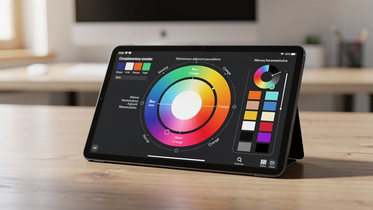
Single colours matter, but colour combinations determine whether a brand identity feels cohesive or accidental. Complementary pairings, such as blue with orange, sit opposite each other on the colour wheel and create the kind of contrast that makes a logo or call-to-action genuinely stand out, a technique also explored in research on color’s role in data storytelling and visual emphasis.
Analogous schemes, built from colours sitting next to each other such as blue, teal, and green, create harmony that suits brands wanting consistency over sharp contrast. Monochromatic palettes, built from shades of a single colour like navy through to sky blue, project a sophisticated and unified look, a strategy Tesla has used effectively with its black, white, and silver product and marketing palette to signal steadiness without visual clutter.
How Color Influences Branding And Marketing Across Channels
Color influence in marketing only compounds when the same palette shows up consistently across every channel a customer encounters, from the website to the service vehicle parked outside their property. A blue-and-grey brand that suddenly turns bright orange on social media or neon green on a sign loses the recognition value that consistent colour builds over months of exposure, so the starting point for any channel-specific decision is the core palette defined at the brand level. Call-to-action buttons deserve particular attention here, since conversion data on brand colors indicates that button colour choices can shift click-through rates by as much as 90% depending on contrast against the surrounding design rather than the specific hue alone.
Website, Ads, And Digital Marketing Colour Strategy
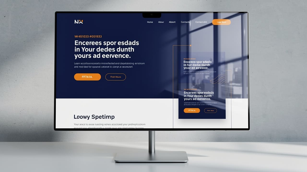
Digital marketing colour strategy centres on contrast and consistency rather than picking a single trendy hue. A red button on a blue or green landing page optimization typically outperforms a red button on a busy, multicoloured layout, because the contrast is what actually drives the eye, not the colour in isolation.
Email marketing and social media benefit from the same discipline, since recognizable brand colours in subject-line graphics and post templates improve recall across repeated impressions. Platform context matters too: LinkedIn audiences respond better to conservative, corporate palettes, while visually driven platforms such as Instagram reward a cohesive, more expressive colour feed.
Vehicle Wraps, Signage, And Print Materials
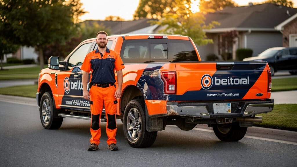
Vehicle wraps and job site signage carry colour psychology into the physical world, where high-visibility colours like orange and yellow ensure a truck or crew remains recognizable and safe in varied lighting and weather conditions. For trades and construction businesses running multiple vehicles across a region, this visibility directly supports both safety compliance and unprompted brand recognition on the road.
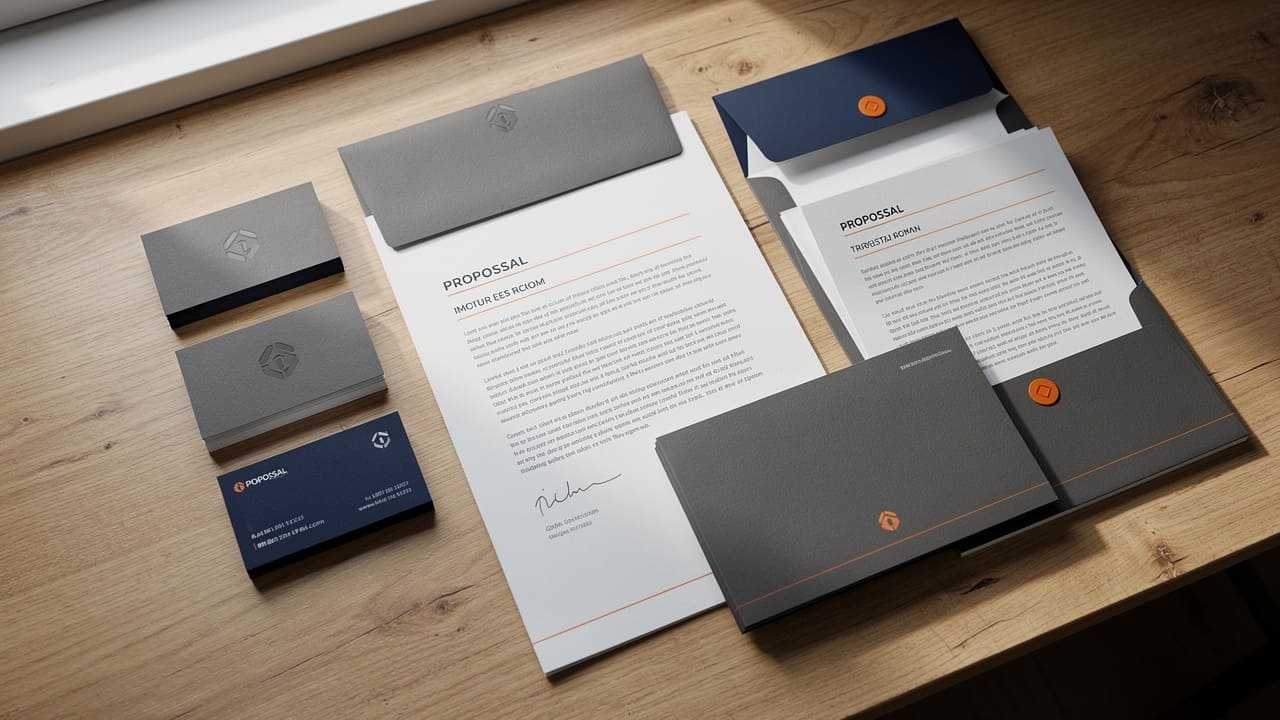
Printed materials such as business cards, proposals, and site signage call for a different emphasis, typically leaning on sophisticated navy, charcoal, and grey to project the credibility that industrial clients expect before signing a contract. Matching the print palette to the digital palette keeps every touchpoint reinforcing the same brand impression rather than working against it.
Which Colours Work Best For Trades, Construction, And Industrial Brands?

Trades, construction, and industrial brands generally perform best when colour choices prioritize trust and reliability over trend-driven aesthetics, since the buying decision in these sectors hinges on confidence in safety, competence, and follow-through. Blue remains the strongest foundational colour for this audience because it consistently tests as the most trusted corporate colour across demographics, a finding aligned with a hybrid color emotional experience model that links specific hues to trust and arousal responses, and pairing it with a warmer accent such as orange or yellow adds approachability without undermining that credibility. Caterpillar’s yellow-and-black equipment branding shows how a high-visibility accent colour can still project heavy-industry authority when paired with disciplined, consistent application.
A dependable rule of thumb for trades and industrial branding: lead with a trust colour, support it with one warm accent, and let consistency do the rest of the work over time.
Matching Colour Strategy To Industry Positioning
Different sub-sectors within the trades and industrial space benefit from slightly different applications of the same core psychology. Construction and building firms typically lean on blue for reliability, layered with warmer accents that soften the corporate feel for residential or commercial clients evaluating several bids.
The following breakdown reflects how colour strategy tends to shift by sub-sector.
Construction and building companies generally anchor their palette in blue to signal reliability, then add a warm accent colour such as orange to keep the brand approachable for property owners comparing multiple contractors.
Trades businesses including plumbing, electrical, and HVAC often combine blue with red or orange, since these customers frequently call during urgent situations and respond to the dual signal of trustworthiness paired with fast, responsive service.
Industrial, oil and gas, and fabrication companies typically favour darker, more sophisticated palettes built around navy, charcoal, and black, reinforcing technical authority and alignment with established safety-culture colour conventions like yellow and orange for hazard communication, similar to the John Deere and Caterpillar approach of pairing dark bases with high-visibility accents.
How Can You Test And Measure Colour Psychology’s Impact On Conversions?
Colour psychology provides a research-backed starting point, but the only way to confirm it’s working for a specific audience is to measure it against real conversion data rather than assume the textbook association applies universally. This matters especially for owners and general managers who are already tracking marketing spend closely, since a colour change that looks better subjectively can still underperform the original if it doesn’t hold up against actual lead-generation numbers.
A/B Testing Colour Choices For Lead Generation
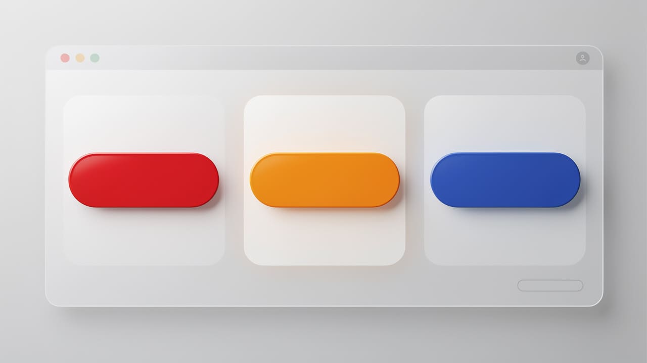
A/B testing colour choices means running two or more real variations of the same page or ad and letting actual visitor behaviour decide the winner rather than personal preference. Platforms like Optimizely, VWO, and Google Optimize’s successor tools make this kind of structured testing accessible even for businesses without an in-house development team. Common tests include:
Swapping call-to-action button colours.
Changing landing page background tones.
Rotating colour variations in paid ad creative across a defined testing period.
The metrics that matter here are quote requests, form completions, and cost-per-lead, not subjective opinions about which version looks more polished. Tracking these outcomes over several weeks gives a business enough data to commit to a colour decision with confidence rather than repeating the guesswork the whole exercise was meant to eliminate. Explore more testing strategies in our guide on conversion rate optimization linked above to build a structured testing cadence.
How Cutting Edge Digital Marketing Applies Colour Strategy For Growth-Focused Businesses
Cutting Edge Digital Marketing treats colour as one input within a larger branding and website system rather than a standalone design flourish chosen for its own sake. Every palette decision made during website design, branding, or ad creative work gets fitted to the client’s specific industry, audience, and growth stage instead of pulled from a generic template shared across unrelated accounts.
That approach matters most for construction, trades, and industrial clients, where the palette needs to project trust and credibility first and visual trendiness a distant second. Because the agency’s design work sits inside a broader system built around lead-tracking and measurable results, colour choices get evaluated against actual conversion performance rather than left as a one-time aesthetic decision nobody revisits. Get started with a colour and brand audit to see where your current palette may be costing you leads.
The Takeaway
Colour psychology in marketing is a measurable growth lever, not a cosmetic afterthought left to personal taste. The core principle worth repeating is straightforward: match colour choices to brand positioning and audience psychology first, then validate those choices with real conversion data rather than instinct alone.
For an established service or industrial business investing meaningfully in marketing each month, getting colour strategy wrong across a website, ad account, and vehicle fleet quietly limits how much that spend can return. Partnering with a strategic marketing team to audit existing colour choices across every channel is a practical next step toward stronger recognition and more qualified leads.
Frequently Asked Questions
Does Colour Psychology Actually Affect Sales, Or Is It Overstated?
Colour psychology has a measurable effect on sales, with research showing colour alone drives up to 90% of snap product judgments and can shift call-to-action click-through rates significantly. That said, colour works alongside copy, offer strength, and site usability rather than replacing them, so it’s one factor among several that determine conversion.
What Colour Is Best For A Call-To-Action Button?
There’s no single best colour for every business, though red and orange generally create the strongest sense of urgency. Effectiveness depends heavily on contrast against the surrounding surrounding page design, so testing a couple of variations against the existing background typically beats defaulting to one “correct” colour.
How Many Colours Should A Brand Palette Include?
Most effective brand palettes use one dominant colour, one secondary colour, and one accent colour reserved for calls-to-action. Adding more than that tends to create visual confusion and dilutes the recognition value that a tighter, more disciplined palette builds over time.
Do Colour Meanings Change Across Cultures In Canada’s Diverse Markets?
Yes, colour meanings shift noticeably across Western, Asian, and Indigenous cultural contexts within Canada’s population. White, for example, symbolizes purity and simplicity in many Western contexts but represents mourning in several East Asian traditions, and red carries celebratory significance in Chinese culture while also serving as a colour of ceremonial and spiritual significance within many Indigenous traditions. Researching the specific audience a campaign targets before finalizing colour choices helps avoid unintended messaging.
How Often Should A Business Revisit Its Brand Colour Strategy?
A brand colour strategy generally deserves review every few years, or sooner after a major rebrand, merger, or shift in target market. Consistency delivers more recognition value than novelty for trades and industrial brands, so frequent colour changes usually cost more in lost recall than they gain in freshness.