

Accessibility in website design means using sufficient colour contrast, scalable text, descriptive alt text, and clean semantic structure so visually impaired visitors can use your site while your branding stays fully intact. Canadian businesses that skip this lose customers before those customers ever pick up the phone. This guide covers the legal standards, core components, testing methods, and a phased rollout plan built for trades, industrial, and service businesses.
This guide walks through the legal standards shaping Canadian websites, the core design components that make a site usable for everyone, and the testing methods that confirm it actually works in practice. We’ll also cover a phased implementation plan suited to trades, industrial, and service-based businesses that can’t pause operations for a full redesign. Cutting Edge Digital Marketing works with Alberta-based service and industrial companies on exactly this kind of foundations-first website strategy, and the sections ahead show how that approach applies to accessibility specifically. Contact us if you’d like a second set of eyes on where your site currently stands.
Key Takeaways
Accessibility in website design is now a legal expectation, not an optional feature, under Ontario’s AODA and the nationally adopted WCAG 2.1 Level AA standard.
Roughly 22% of Canadians report living with a disability, according to a demographic, employment and income profile of persons with disabilities, representing a sizeable customer base that an inaccessible site simply cannot serve.
Accessible design overlaps directly with technical SEO, meaning alt text, clean headings, and fast load times boost rankings and usability at the same time.
A phased, foundations-first rollout beats an expensive all-at-once overhaul for businesses with limited internal marketing resources.
Cutting Edge Digital Marketing builds accessibility considerations into the design process from day one rather than treating it as an afterthought.
Table of Contents
- What Is Accessibility In Website Design And Why Does It Matter?
- What Are The Legal Requirements For Website Accessibility In Canada?
- What Are The Core Components Of An Accessible Website?
- How Do You Test And Audit A Website For Accessibility?
- How Can Service-Based Businesses Implement Accessibility Without A Full Redesign?
- What Business Benefits Come From Investing In Accessible Design?
- The Takeaway
- Frequently Asked Questions
What Is Accessibility In Website Design And Why Does It Matter?

Accessibility in website design means building a site that a visitor with a visual impairment can use just as effectively as any other visitor, without stripping away the colour, imagery, or personality that makes your brand recognizable. In practice, this means sufficient colour contrast behind your headlines, alt text describing your project photos, and body copy that scales up to 200% without breaking your layout, all of which sit comfortably alongside strong visual branding rather than competing with it. The same design thinking extends to users with hearing loss, motor disabilities, and cognitive differences, as well as situational limits like a supervisor reading a quote on a cracked phone screen at a rural job site with a weak signal.
For service and industrial businesses, this isn’t an abstract design principle, it’s a direct lead generation issue. A site that excludes visitors with disabilities also tends to frustrate procurement teams evaluating vendors, government clients with compliance checklists, and ordinary customers who simply give up and find a competitor with a cleaner, faster, easier-to-read website. Every barrier removed is a potential lead retained, which is exactly why accessibility deserves a seat at the same table as your branding and conversion strategy.
What Are The Legal Requirements For Website Accessibility In Canada?
Canadian businesses operate under a patchwork of accessibility legislation that, together, makes digital accessibility a genuine compliance matter rather than a nice-to-have. Ontario’s Accessibility for Ontarians with Disabilities Act requires organizations with 50 or more employees to meet specific web accessibility standards, and many smaller Ontario businesses choose to comply voluntarily to widen their customer reach and strengthen their public image. Beyond Ontario, the Web Content Accessibility Guidelines, now at version 2.1, have become the de facto national benchmark, with municipalities, government agencies, and increasingly large enterprises requiring Level AA conformance as a baseline expectation for their vendors and partners. This matters acutely for industrial, oil and gas, and equipment companies, where accessibility compliance is frequently written into procurement criteria before a contract is even discussed, and for construction and trades businesses whose commercial clients now expect the same inclusive standards they hold themselves to. Provincial approaches vary somewhat, with British Columbia, Manitoba, and Nova Scotia each introducing their own accessibility frameworks, but the practical takeaway for any Alberta-based or Western Canadian business is the same: targeting WCAG 2.1 Level AA protects you across jurisdictions rather than leaving you exposed in the one where your next big client happens to be based.
Which WCAG Principles Should You Prioritize First?
WCAG organizes its guidelines around four principles known by the acronym POUR, and prioritizing them in order gives service businesses a practical starting checklist. Perceivable means content can be seen or heard, such as alt text on a project photo so a screen reader can describe it. Operable means every function works without a mouse, such as a contact form that’s fully usable via keyboard alone. Understandable means labels and instructions are written in plain, predictable language rather than industry jargon a first-time visitor won’t recognize. Robust means your code works cleanly with assistive technologies, browsers, and devices your visitors actually use. For most service-based businesses, targeting Level AA across all four principles strikes the right balance between thoroughness and practicality.
What Are The Core Components Of An Accessible Website?
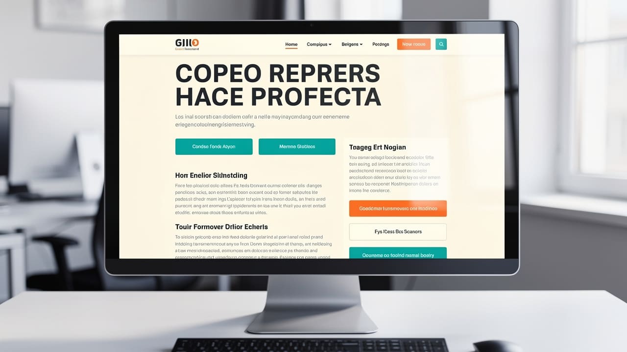
Accessibility in website design comes down to a handful of concrete, testable elements rather than a vague design philosophy, and getting these right addresses the majority of barriers visitors with visual impairments actually encounter. Colour contrast sits at the foundation, with WCAG requiring a minimum ratio of 4.5 to 1 for normal text and 3 to 1 for larger text, a standard that a surprising number of professionally designed sites still fail because of trendy light-grey typography choices. Alt text on every meaningful image, from a finished job site photo to a technical equipment diagram, lets screen reader users understand what sighted visitors see instantly, while purely decorative images should carry empty alt attributes so they don’t clutter the screen reader experience. Text needs to scale up to 200% without breaking the layout or forcing horizontal scrolling, which matters enormously for older visitors and anyone reading a quote request on a small screen in bright daylight. Keyboard accessibility rounds out the technical core, since users with motor disabilities or screen reader dependence need every link, button, and menu reachable without a mouse, supported by a clearly visible focus indicator, a logical tab order that follows the page’s visual flow, and a skip-to-content link so keyboard users aren’t forced to tab through the full navigation menu on every single page.
Several supporting elements reinforce this foundation and deserve equal attention during design or redesign work.
Heading hierarchy should follow a single H1 per page with logically nested H2 and H3 tags, giving screen reader users a reliable map of the page instead of a wall of undifferentiated text.
Colour independence means information is never conveyed through colour alone, so an error state needs a text label or icon alongside the red highlight, benefiting colour-blind users and anyone viewing the page in poor lighting.
Semantic HTML markup ensures lists, tables, and buttons are coded as what they actually are, rather than styled to merely look that way, so assistive technologies interpret them correctly.
Responsive, touch-friendly layouts with touch targets of at least 44 by 44 pixels prevent misclicks for users with limited dexterity accessing a site from a job site tablet or phone.
How Do You Build Accessible Forms And Multimedia?
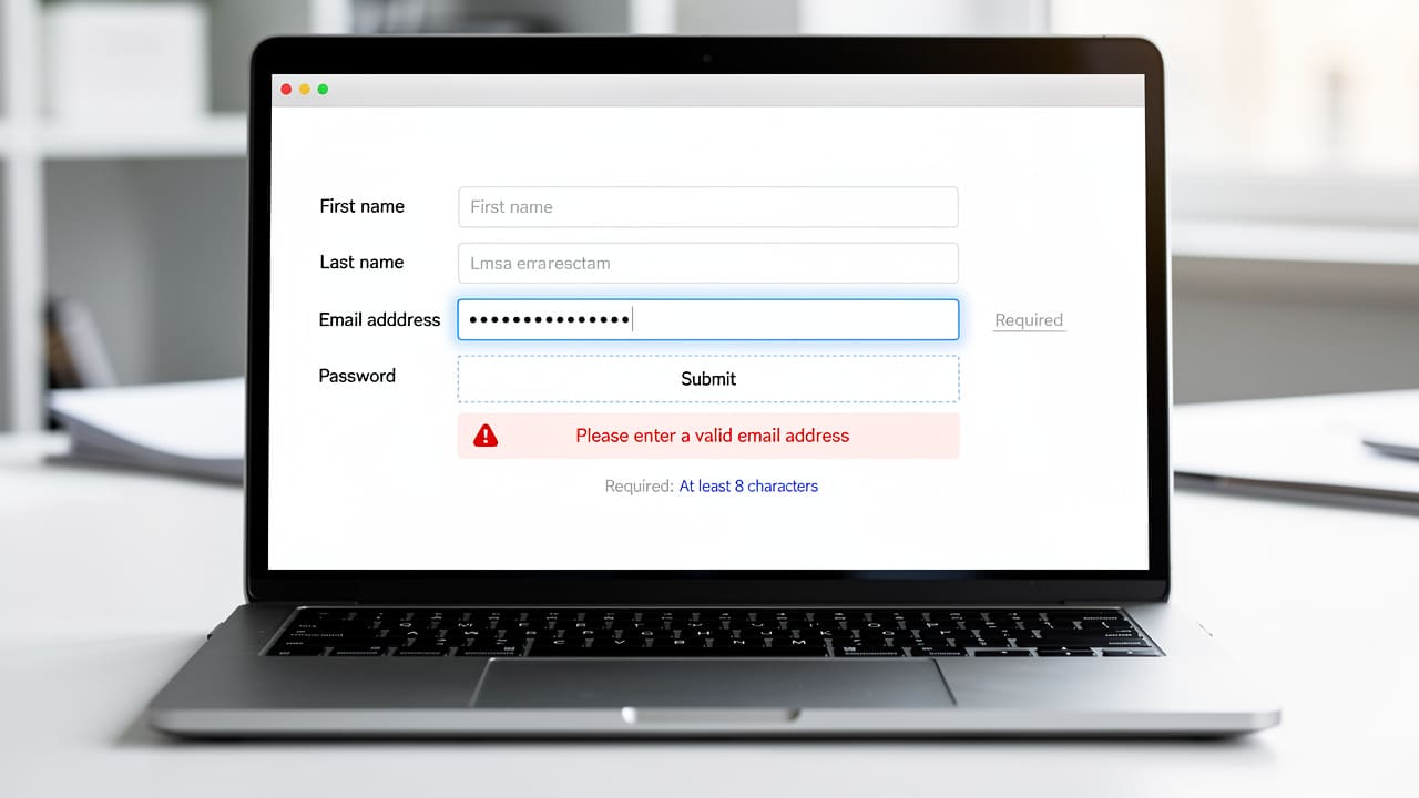
Forms and multimedia content deserve dedicated attention because they’re usually where leads actually convert or videos actually explain your services. Every form field needs a label that stays visible and is properly linked in the code, since placeholder text that vanishes once someone starts typing leaves screen reader users without guidance. Error messages should state exactly what went wrong and how to fix it, marked with text or an icon rather than colour alone, and required fields need a clear text indicator rather than an asterisk nobody explains. For instructional or safety videos common on trades and industrial sites, captions and transcripts make the content usable for deaf or hard-of-hearing viewers and for anyone watching without sound in a noisy shop or warehouse.
How Do You Test And Audit A Website For Accessibility?

Testing a website for accessibility means combining automated scans with hands-on manual review, since neither method alone catches everything a real visitor might encounter. Automated tools like WAVE, Axe, and Lighthouse scan a site in minutes and flag obvious issues such as missing alt text or failing contrast ratios, but these tools typically catch only 30 to 40% of actual accessibility barriers because they can’t judge context, logical flow, or whether a screen reader experience genuinely makes sense. Manual testing closes that gap, with a tester navigating the entire site using only a keyboard and running it through assistive technology like NVDA or VoiceOver to confirm headings, forms, and navigation behave the way a real user with a disability would need them to.
| Testing Method | Speed | Coverage | Best Used For |
|---|---|---|---|
| Automated tools (WAVE, Axe, Lighthouse) | Minutes | ~30-40% of issues | Quick scans, contrast checks, missing alt text |
| Manual and screen reader testing | Hours to days | Context-dependent issues | Navigation logic, forms, real-world usability |
For a business without unlimited budget or time, the smartest approach is prioritizing fixes by impact rather than chasing every edge case a testing report surfaces. Form functionality, navigation clarity, contrast, and page structure affect the largest share of visitors and typically deliver the best return for the effort involved, so addressing those four areas first before working through smaller refinements tends to produce the most noticeable improvement in both usability and compliance standing.
A useful rule of thumb in accessibility work: fix what affects the most visitors first, then work down to the edge cases. The widest barriers usually involve contrast, navigation, and forms, not the smaller cosmetic details a report might flag.
How Can Service-Based Businesses Implement Accessibility Without A Full Redesign?
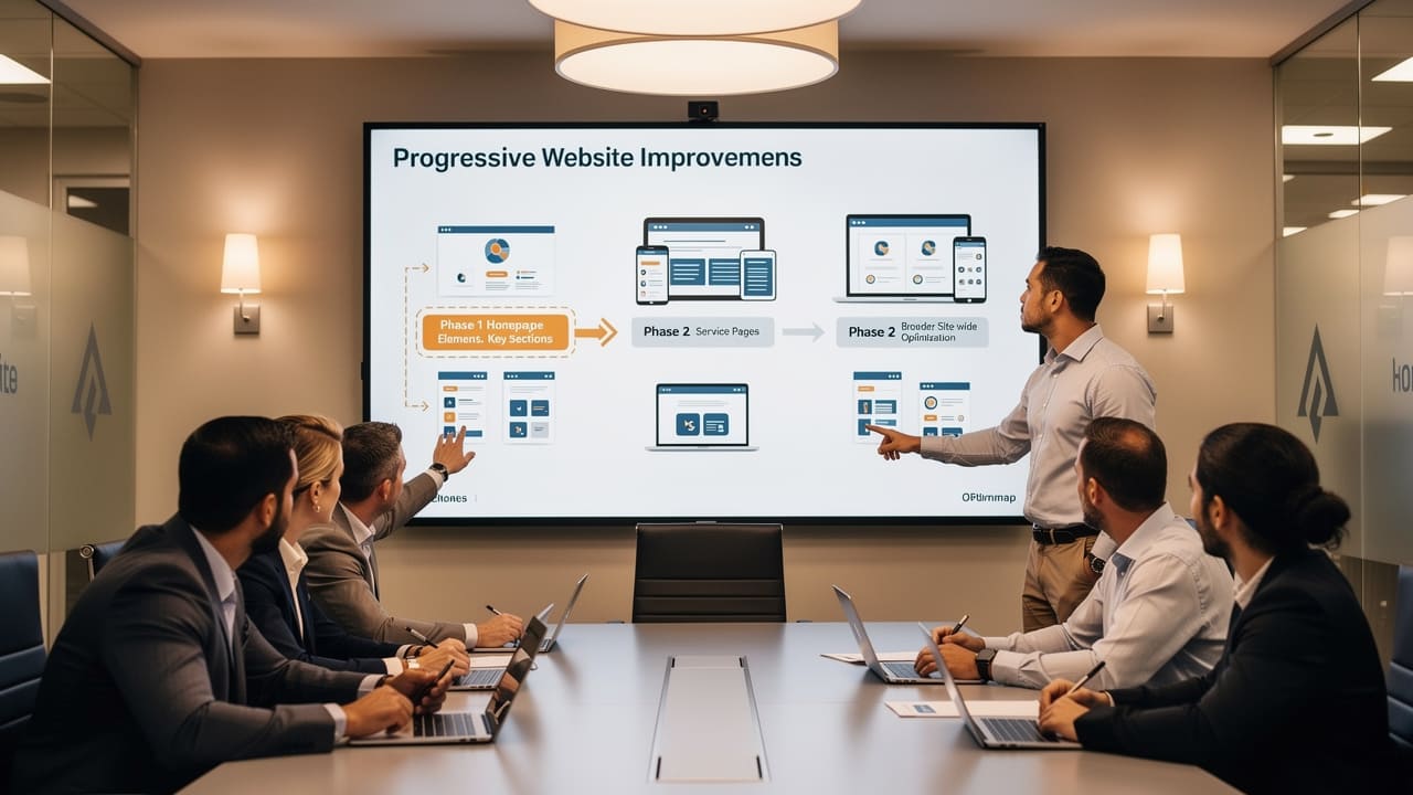
Implementing accessibility in website design doesn’t require tearing down an full redesign, and a phased approach fits the reality of businesses that can’t pause lead generation while changes happen. The most effective starting point is auditing the pages that actually drive revenue first, meaning your homepage, service pages, and contact or quote request forms, since these carry the highest traffic and the highest conversion stakes if a visitor with a disability can’t complete them. From there, remediation spreads outward to secondary pages, and ongoing maintenance becomes part of the standard workflow so that new content, new service pages, or a future redesign don’t quietly reintroduce the same barriers you just fixed. Training whoever manages your website day to day, whether that’s an internal marketing coordinator or an outside agency, on basic accessibility habits prevents the kind of regression that turns a one-time fix into a recurring problem.
A practical phased rollout generally looks like this for a mid-sized service or industrial business.
Audit high-traffic pages first, focusing on the homepage, core service pages, and any lead capture form, since fixing these delivers the fastest visible improvement.
Remediate by impact, prioritizing colour contrast, alt text, and keyboard navigation before tackling smaller cosmetic issues that affect fewer visitors.
Train the team responsible for ongoing updates, so new blog posts, service pages, or image uploads don’t undo the progress already made.
Schedule recurring audits, ideally after any major site update, to catch new barriers before they affect real visitors.
Why Partner With A Strategic Web Design Team Instead Of Going It Alone?
Many business owners simply don’t have the internal bandwidth to manage accessibility alongside everything else running a growing company demands, which is where an experienced web partner earns its value. Cutting Edge Digital Marketing builds every website on solid technical foundations, covering structure, tracking, and usability, before layering on marketing tactics, and that foundations-first sequencing naturally supports accessible design rather than treating it as a bolt-on. Working extensively with construction, trades, and industrial means understanding that a single site’s visitors might range from a field supervisor on a cracked phone screen to a procurement officer reviewing vendor compliance on a desktop, and designing with that full range in mind from the start. Rather than functioning as a one-off vendor, the agency positions itself as a long-term strategic partner handling these design decisions on the client’s behalf so accessibility stays consistent as the site grows. If your current site could use this kind of foundations-first review, get started with a conversation about where the gaps are.
What Business Benefits Come From Investing In Accessible Design?
Investing in accessibility in website design pays off well beyond avoiding legal risk, starting with market reach that many businesses simply haven’t accounted for. Approximately 22% of Canadians report living with a disability, representing millions of potential customers whose business is effectively unreachable through an inaccessible site, and a psychophysiological study on web accessibility’s impact on cognitive engagement shows that many accessibility practices, including descriptive alt text, clean heading structure, and fast load times, overlap directly with the technical SEO factors search engines already reward.
Beyond reach and rankings, accessible design offers competitive differentiation in markets where too many competitors still rely on templated, low-cost website providers that never considered usability at all. A professional, inclusive site signals credibility to procurement teams and enterprise clients evaluating vendors, while proactively addressing accessibility barriers reduces legal exposure as regulations continue tightening across provinces. Together, these compounding advantages make accessibility one of the more efficient investments a growth-focused business can make in its digital presence.
The Takeaway
Accessibility in website design has moved from a specialist concern to a foundational requirement for any Canadian service, trades, or industrial business that wants its site to convert visitors into qualified leads. The path forward follows a clear sequence, starting with an honest audit, prioritizing the fixes with the widest impact, remediating methodically, and maintaining those standards as the site evolves with new content and features. Businesses that treat accessibility as part of their core website strategy, rather than a compliance checkbox handled once and forgotten, tend to see the benefit show up in broader reach, stronger search visibility, and a more credible brand impression. Cutting Edge Digital Marketing works alongside Alberta and Western Canadian businesses to build that kind of strategy directly into the website foundation, so accessibility and results-driven design move forward together rather than competing for attention. Learn more about how a foundations-first approach could work for your site by reaching out to the team.
Frequently Asked Questions
What Is The Minimum Colour Contrast Ratio Required For Website Text?
WCAG 2.1 Level AA requires a contrast ratio of at least 4.5 to 1 for normal body text and at least 3 to 1 for larger text, such as headings sized 18 points or bigger. Free tools like the WebAIM Contrast Checker let you test any colour combination in seconds before a design goes live, catching issues early.
Do Small Businesses Legally Need To Comply With AODA Or WCAG?
Ontario’s AODA formally applies to organizations with 50 or more employees, so many smaller businesses fall outside its strict legal threshold. That said, enterprise clients, government agencies, and procurement processes increasingly expect WCAG 2.1 Level AA regardless of company size, making voluntary compliance a smart competitive move for smaller service businesses too.
How Much Does It Cost To Make A Website Accessible?
Cost depends heavily on scope, since an initial accessibility audit costs far less than a full remediation project addressing every flagged issue at once. Building accessibility in during a planned redesign is consistently cheaper than retrofitting an existing site later, which is why a phased approach tends to control spending most effectively.
Can Accessibility Improvements Affect My Website’s SEO Rankings?
Yes, accessibility improvements and technical SEO overlap significantly, since alt text, clean heading structure, and fast load times matter to both screen readers and search engine crawlers. Improving one tends to improve the other, supporting organic lead generation while also addressing compliance requirements at the same time.
How Often Should An Accessible Website Be Re-Tested?
A full audit at least once a year is a reasonable baseline, with additional spot checks after any major redesign, new feature launch, or significant content update. New pages and features can quietly introduce contrast, navigation, or labelling issues that weren’t present during the last review, so periodic testing catches regressions before visitors do.